A survey taken of all prospective customers of Mighty Networks, a Saas based community platform suggested that the UI looking "dated" was a key consideration when it came to choosing competitors over our offering. Since our platform offers options to represent an indivudal community brand, it is important that those brands are represented well visually. I was tasked along with our design team of 5 designers, to address this customer feedback while keeping speed in mind.
Mighty Networks is a Saas platform with many diverse and flexible features, that has become more information heavy over the years. In order to address our main brief, our team followed up with an internal survery to validate the concerns. We found that the internal team aligned very strongly with the customer sentiment.

Through my explorations, I found that the experience drastically improved when I focused on the most necessary elements of UI. I advocated for an approach that leaned in to simplicty and removing information that was not necessary.

I owned creation and development of content components
We divided the new system into base tokens, atomic and feature components. I lead all of feature component development. My approach was based on the design principles "Simple and Solid", creating flexible components that that take in similar data types and display them per content type
Because over time each of these content views have become over cluttered with information, so limiting them to the data that is the same across all content types made it more visually appealing.

I created a visual language for all content cards that utilized minial atomic components
Since our Saas platform includes many surfaces for the same inforamtion to be displayed in different ways, I focused on a visually cohesive approach to components. This way they would take in the same input data, display similarly but with visual distinctions that aided in clear user experience.

Establishing the component as the source of truth
I worked closely with the engineering team to define components that included most of the information they needed to build them utilizingFigma tools like Dev mode and Playground. This reduces the overhead and focuses on creating just enough documentation to build the component correctly.

Before committing to this design system process, I decided to run a small test of the design to development handoff of payment page components. I worked with our web engineers to define the payment component variants, consider all the different cases for the component, test them in playground, develop and deploy them in under 3 weeks. This process proved that we could achieve our next steps for the rest of the design system.

Content Discovery
BEFORE: Scrolling left to right with multiple different card styles and an awkward cut off point on the carousel.

AFTER: a grid style of card presentation with overflow pagination.

Platform Search
BEFORE: a variaty of cards sizes and cluttered information to represent each kind of searched content.
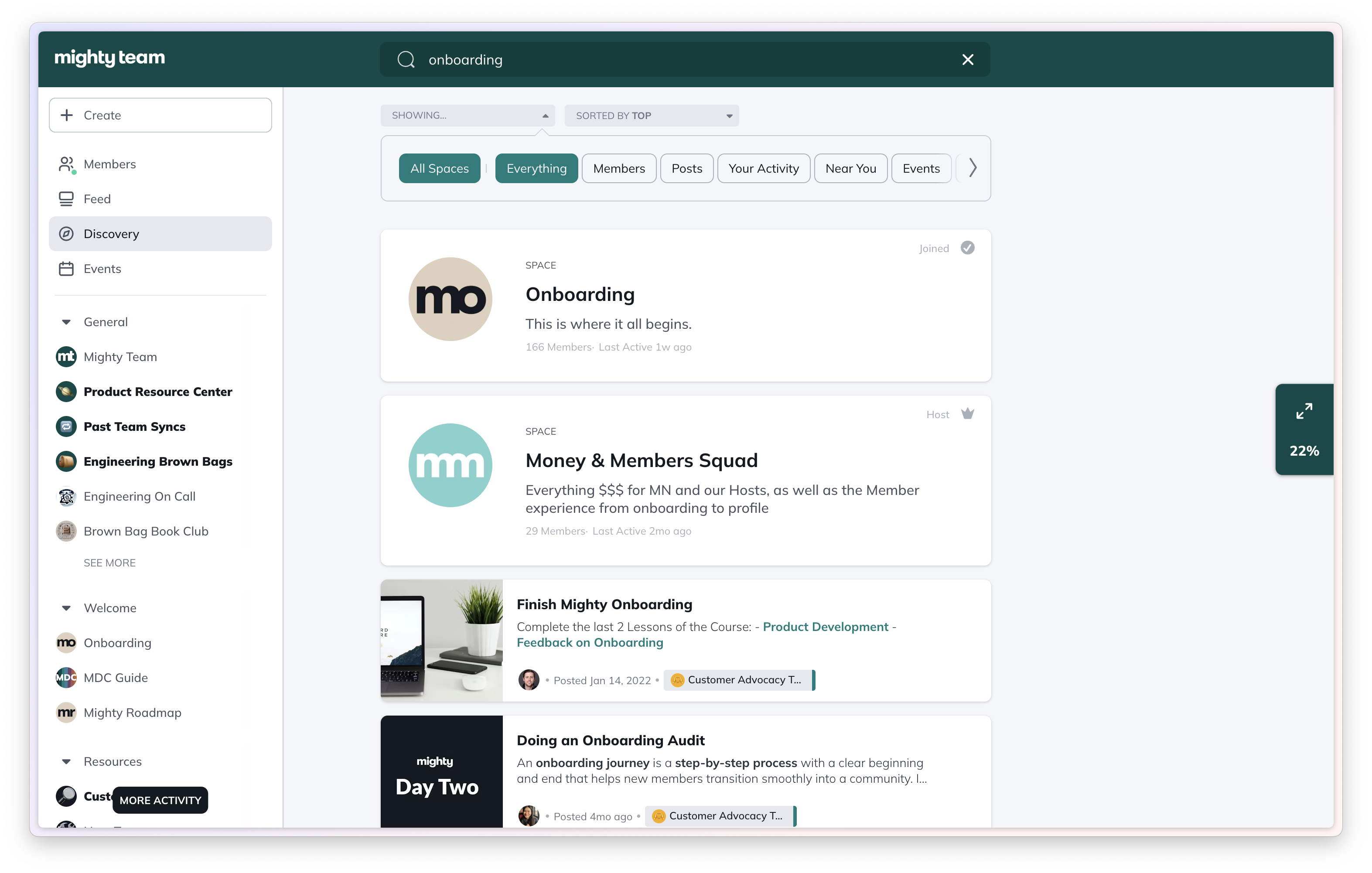
AFTER: a uniform list of search items, displaying the minimum amount of data from each content type.

Purchase Page Header
BEFORE: Poorly spaced header component with confusing information heirarchy and color usage.
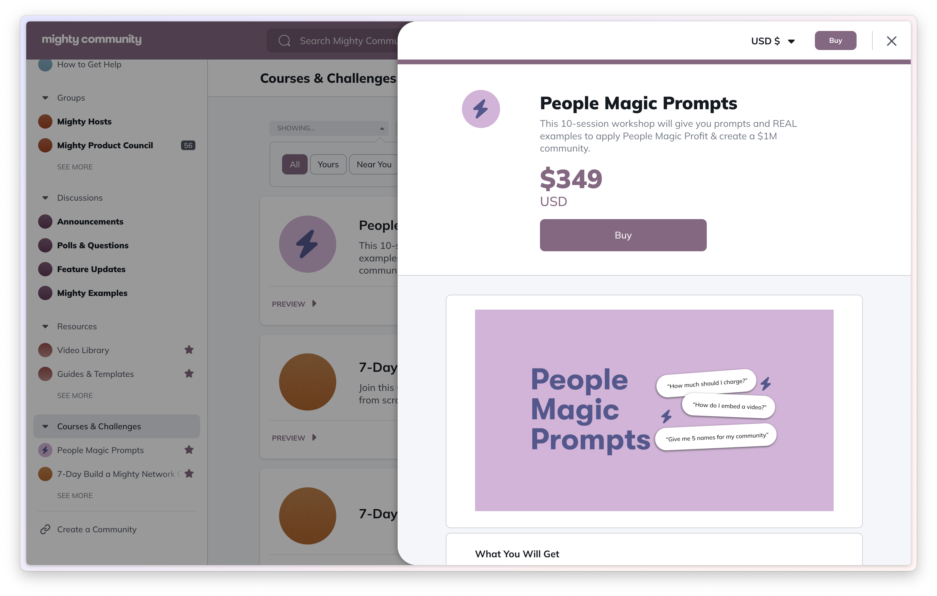
AFTER: Improved spacing, information heriarchy and primary action emphasis.

Simplicity is the product of good design.
It took a lot of iterations to settle on the style of feature components that maintained a "Simple and Solid" approach. Keeping the experience simple, modular, and uniform across the platform leads to user familiarity and ultimately modern, visual cohesion.
Consideration of Engineering needs is the key to success.
Collaborating with engineers throughout the design process lead to a smooth implementation of design systems and reduces the need for extra, unnecessary documentation.